Pinterest Color Trends 2026
In 2026, color is no longer just a visual choice—it is a reflection of how people feel, think, and live. The latest Pinterest color trends reveal a powerful shift in global creativity, where emotion, identity, and human values take priority over short-lived aesthetics.
Rather than focusing on a single “color of the year,” Pinterest presents a carefully curated palette that mirrors real human behavior, aspirations, and emotional needs. These colors are bold yet thoughtful, expressive yet grounded, and designed to resonate deeply rather than shout loudly.
In 2026, color is no longer just a visual choice—it is a reflection of how people feel, think, and live.
1. The Cultural and Emotional Context Behind Pinterest Colors 2026
As the world continues to navigate uncertainty and rapid change, people are seeking calm, meaning, and authenticity. As a result, color trends in 2026 reflect a collective desire for:
-
Emotional balance and reassurance
-
A sense of trust and safety
-
Stronger connection with nature
-
Freedom of self-expression and individuality
-
Sustainable and responsible choices
Because of this, Pinterest color trends move beyond decoration. Instead, they function as emotional tools that support well-being, connection, and long-term relevance.
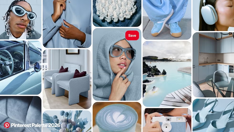
Cool Blue represents peace, clarity, and mental calm. Inspired by sky, ice, and open space, it provides a sense of stability in an overstimulated world.
2. The Core Colors Defining Pinterest 2026
Pinterest 2026 is shaped by five key colors: Cool Blue, Jade, Plum Noir, Wasabi, and Persimmon. Each color carries its own emotional role, while together they form a balanced and meaningful palette.
2.1. Cool Blue: Calm, Clarity, and Trust
Cool Blue represents peace, clarity, and mental calm. Inspired by sky, ice, and open space, it provides a sense of stability in an overstimulated world. Consequently, this color is closely associated with reliability, intelligence, and modern confidence.
In design and branding, Cool Blue works especially well for wellness, lifestyle, and contemporary products that aim to feel calm, clean, and trustworthy.
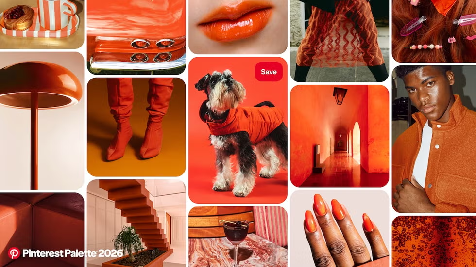
Persimmon brings warmth and emotional openness into the palette.
2.2. Jade: Balance Between Nature and Refinement
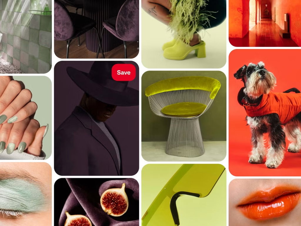
Jade sits at the intersection of nature and sophistication. This green tone reflects growth, harmony, and emotional balance, while still maintaining a sense of quiet luxury.
Because of its grounding quality, Jade is widely used in wellness, beauty, and sustainable design. At the same time, it communicates maturity and long-term thinking.
2.3. Plum Noir: Depth, Mystery, and Creative Power
Plum Noir is rich, dark, and emotionally intense. Unlike traditional dark tones, it feels expressive rather than restrained. This color speaks to creativity, confidence, and individuality.
As a result, Plum Noir is ideal for premium branding, limited editions, and designs that aim to create intrigue, depth, and strong emotional impact.
2.4. Wasabi: Energy, Boldness, and Disruption
Wasabi is vibrant, electric, and impossible to ignore. This sharp green tone symbolizes courage, experimentation, and creative risk. Rather than blending in, it challenges visual conventions.
In branding and packaging, Wasabi is often used as a bold accent color to capture attention and communicate innovation, youthfulness, and forward-thinking ideas.
2.5. Persimmon: Warmth, Optimism, and Human Connection
Persimmon brings warmth and emotional openness into the palette. This rich orange tone evokes creativity, joy, and vitality. It feels welcoming, expressive, and deeply human.
Because of its emotional strength, Persimmon is particularly effective for consumer goods, food, lifestyle products, and packaging that aims to build connection and positivity.
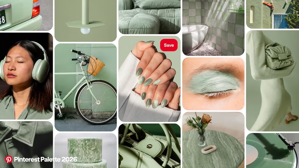
Jade sits at the intersection of nature and sophistication. This green tone reflects growth, harmony, and emotional balance, while still maintaining a sense of quiet luxury.
3. The Deeper Meaning of Pinterest Color Trends 2026
Together, these colors reflect a broader shift in how color is used:
-
Emotionally, they comfort, energize, and reassure
-
Psychologically, they signal maturity and self-awareness
-
Socially, they represent sustainability, inclusivity, and authenticity
In short, color in 2026 is not meant to impress instantly. Instead, it is designed to stay meaningful over time.
4. Pinterest 2026 Colors and Packaging Design
Softer Visual Language, Stronger Emotional Impact
In packaging design, Pinterest 2026 colors encourage brands to move away from visual noise. Instead of loud contrasts, brands are choosing palettes that feel intentional, calm, and emotionally aligned with their audience.
As a result, packaging communicates trust and values rather than just grabbing attention.
Color as Brand Storytelling
Each color plays a storytelling role on packaging:
-
Earth-inspired tones suggest sustainability and honesty
-
Soft neutrals communicate elegance and balance
-
Bold accents express creativity and differentiation
Through thoughtful color use, packaging becomes a medium for brand philosophy, not just a protective layer.
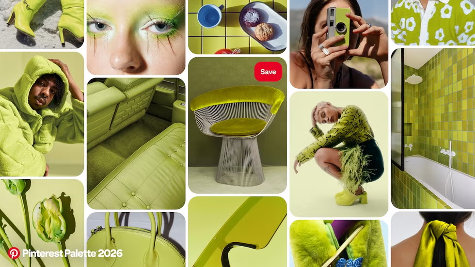
Wasabi is vibrant, electric, and impossible to ignore.
A Natural Match for Paper and Eco-Friendly Packaging
Pinterest 2026 colors align perfectly with paper packaging and sustainable materials. Lower saturation tones respect the texture of paper, reduce excessive ink usage, and enhance the natural beauty of eco-friendly packaging.
Therefore, these colors are especially relevant for brands focused on long-term sustainability and responsible production.
5. How Brands Can Apply Pinterest 2026 Colors Strategically
To use these trends effectively, brands should:
-
Avoid overusing overly aggressive or saturated colors
-
Choose harmonious palettes with emotional depth
-
Align color choices with brand values and identity
-
Focus on consumer feelings rather than short-term trends
When applied consistently across packaging, branding, and communication, color becomes a powerful strategic asset.
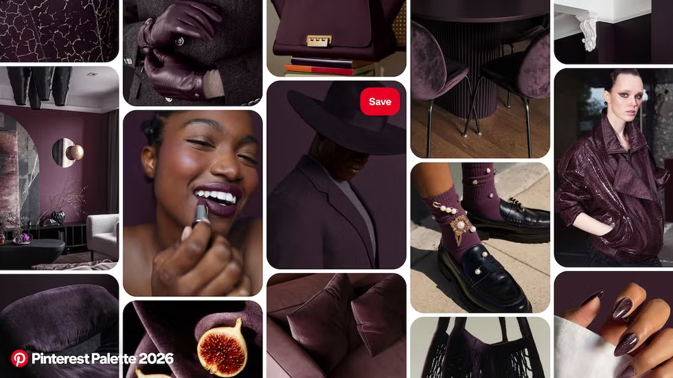
Plum Noir is rich, dark, and emotionally intense. Unlike traditional dark tones, it feels expressive rather than restrained.
6. Conclusion: Color as a Reflection of Human Values in 2026
Pinterest color trends for 2026 are not about following fashion. They represent a deeper creative philosophy—one rooted in emotion, balance, sustainability, and human connection.
For brands and designers, understanding these colors means understanding the people behind them. In 2026, color is no longer just seen—it is felt, remembered, and trusted.
Operating under the motto of “Pioneering Quality,” Hoang Vuong consistently aims for sustainable and environmentally friendly packaging solutions. We proudly hold the following certifications: FSC Certification, GMI Certification, G7 Certification, ISO 9001:2015
With over 15 years of experience in the paper packaging industry and a solid brand reputation, Hoang Vuong is a leading private paper packaging enterprise in Vietnam, partnering with numerous major brands locally and internationally. We accompany your company on the journey of innovation, seeking differentiation through continuous improvement. Your success is both an achievement and motivation for us to continue innovating and maintaining professionalism.
- Address: 1717B TL10 Street, Tan Tao Ward, Binh Tan District, Ho Chi Minh City
- Mobile: 0908.863.965 (Mr. Le Hong Son)
- Phone: 028.62696129 – 028.22481926
- FAX: 08.62696032
- E-mail: havupackage@gmail.com
- Website: www.baobigiay.vn – www.hopcungcaocap.vn
Các đối tác uy tính tin cậy đã ủng hộ chúng tôi
Đối Tác Tiêu Biểu